HEN HOUSE
Objective
Reimagine egg packaging to balance function, shelf presence, and clear communication, while considering organic options and environmental impact
Solution
I created a fresh brand for egg products with sustainable materials, bold patterns, and inviting illustrations. I focused on making packaging that excites consumers and encourages them to crack it open and discover what’s inside.

Hatching an Identity
Named after hens who lay their eggs in a safe and cozy "house," Hen House was born! A brand focused on the future of organic egg products while also keeping in mind structural improvements to better shell-ter the product.

The egg’s round shape is echoed in the font’s soft, rounded corners. The brand conveys a natural, modern, organic, and bold feeling, while a small yolk inside the “o” adds an egg-citing touch to the identity.


As the identity system cracked open, playful patterns and custom illustrations brought the brand to life. Vertical lines nod to a farm, while bold, graphic elements give a modern twist to a brand you’ll
egg-sperience every day!


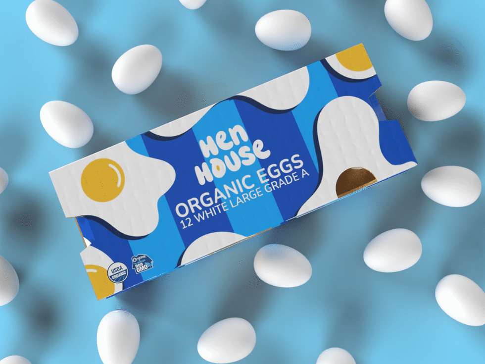
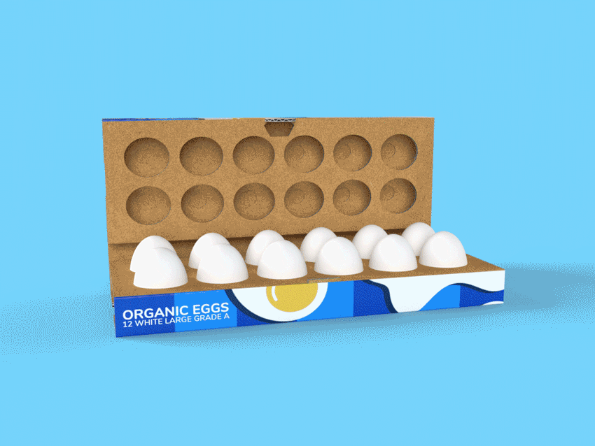
The Shell-ter
These graphics were designed for a standard egg carton but with a focus on reimagining the structure for sustainability and protection. This design balances shelf visibility, egg layout, and stability, allowing branding and graphics to shine while keeping the eggs safe.


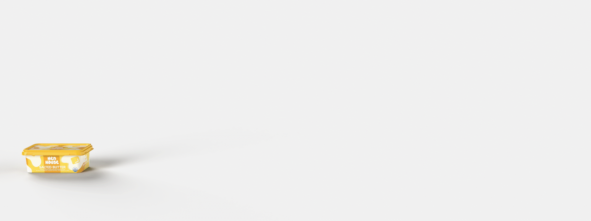
Product Eggs-tensions
I had to take a crack at other products in the Hen House lineup! Custom illustrations and a bold color system give each product its own personality, helping them stand out among the competition.


.jpg)
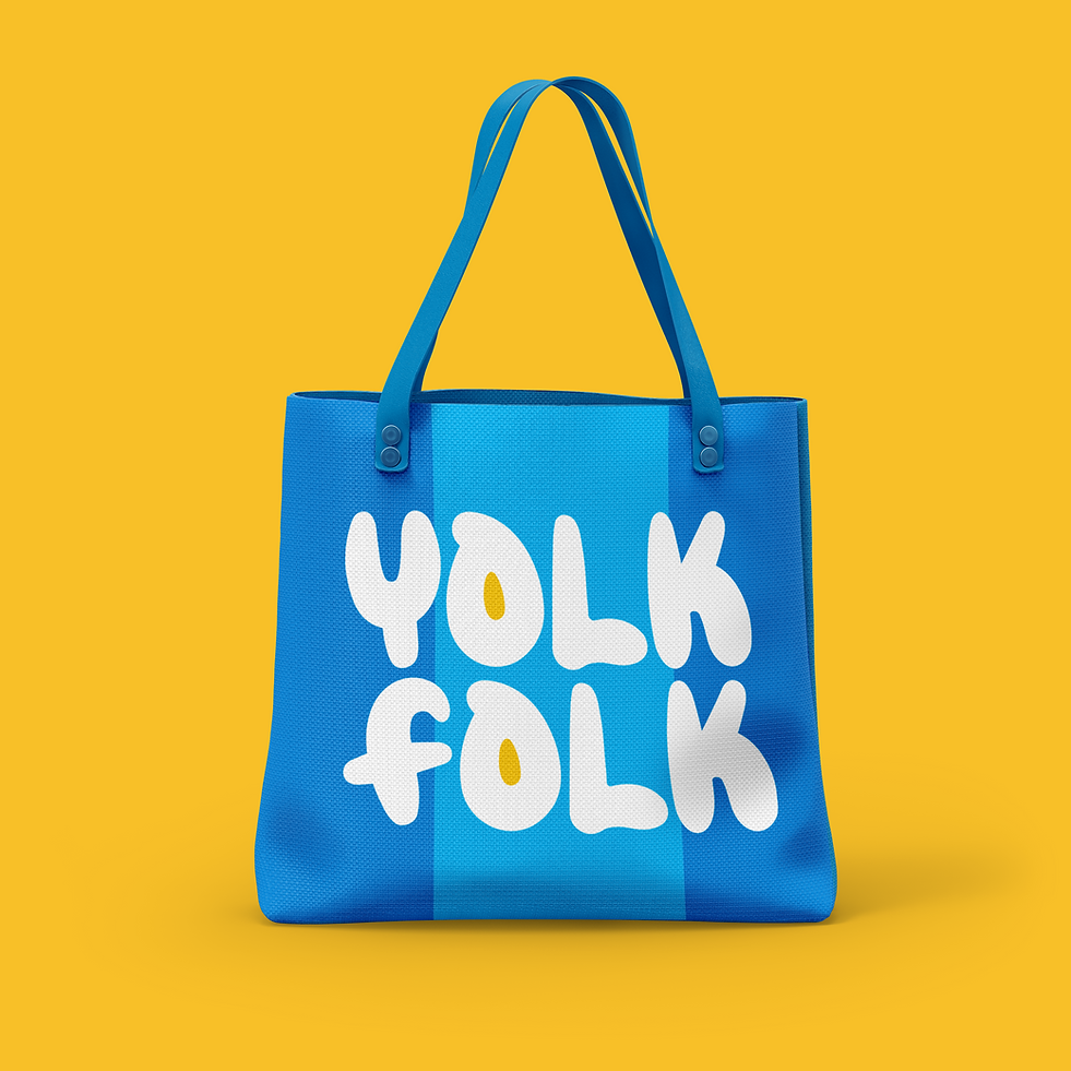
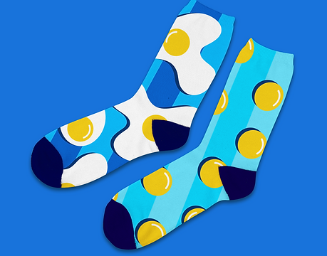
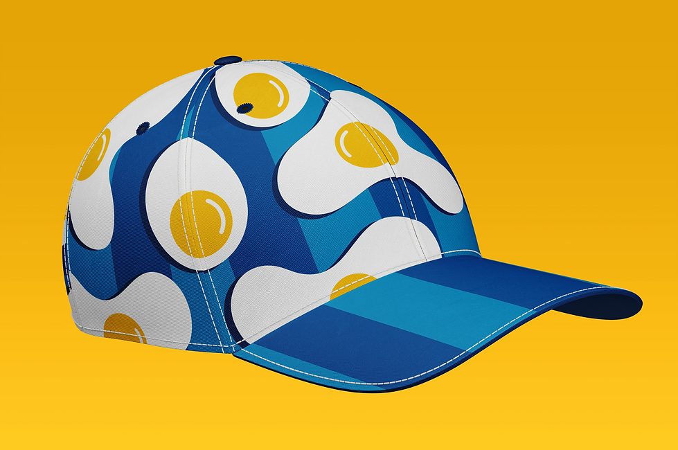
Eggs-tra Playful Merch
It's always fun to see how the system can come to life! Playful illustrations and some final puns are the perfect mix to wrap up Hen House.