I HEART EGGO
Eggo is a wholesome, family brand that loves their customers. This brand refresh celebrates the love between Eggo and its fans. I kept Eggo's core identity and turned the “E” into a playful, hand-drawn heart to capture that warm, family feeling while hinting at a more wholesome start to the day.
Identity Refresh
This refresh celebrates the love between Eggo and its fans. I kept the brand’s integrity while giving the “E” a hand-drawn, heart-like twist that captures a family-first warmth while positioning Eggo as the heart of a good breakfast. The heart shape can also flex to highlight the brand’s sustainability goals and nourishing our planet.

Original Logo
Refreshed Logo


Iconography
I designed a small series of icons to carry that homemade, heartfelt touch across the brand’s channels.

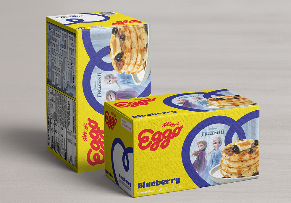
A New Love for Packaging
Start the day with a little love! I refreshed Eggo’s packaging by turning the heart-shaped “E” into a frame for food photography and partnerships, plus added fun games to make breakfast even more interactive. Now no one will want to L’eggo of these Eggos!